Web design trends move fast. A site that felt modern two years ago can start feeling a little behind today, simply because people’s tastes and expectations keep shifting.
For anyone involved in this industry, whether you’re a designer, developer, or business owner trying to keep up, following trends isn’t really about chasing hype. It’s about staying relevant. When your site looks and feels modern, it builds trust. People stick around longer, and your brand comes across as more credible. That matters more than you’d think. One study done by Lindgaard, Fernandes, Dudek, and Brown found that people form a first impression of a website in about 50 milliseconds. That’s before they’ve even started reading.
In 2026, we’re seeing sites move toward something that feels more human and more practical at the same time. More breathing room in layouts. Clearer typography. Bolder use of color. Small animations that feel smooth instead of flashy. And accessibility being treated like it actually matters, not just an add-on.
So here are 5 web design trends shaping 2026.
1. Layouts That Breathe
For years, the standard grid layout was basically the default for everything. Neat columns. Even spacing. Everything lined up perfectly. And honestly, it still works fine for a lot of things. But when every single site on the internet uses the same layout structure, nothing feels special anymore.
In 2026, designers are starting to loosen things up a bit. You’re seeing more curved section breaks instead of straight horizontal lines. Bigger gaps between sections so things don’t feel so crammed together. A bit of asymmetry that actually looks intentional. Softer backgrounds and shapes that make pages feel less like they came from a template.
The reason this works is pretty simple. When a layout has room to breathe, your content stands out more and the page just feels easier to look at. There’s actually some interesting research behind it too. Some studies have shown that people tend to feel more relaxed around curved shapes compared to the sharp ones.
This trend started showing up in wellness brands and creative agencies first, which makes sense. But it’s spreading now. You see it on fashion sites, lifestyle brands, even some bigger business sites that used to play it safe with their layouts.
Sites worth looking at
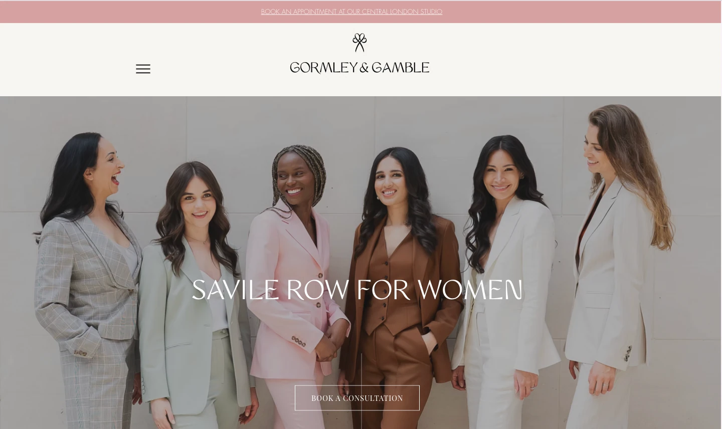
Gormley and Gamble is a good example of how calm, uncluttered spacing can work really well for a tailoring brand. Everything has room, so the site feels easy to read and browse.
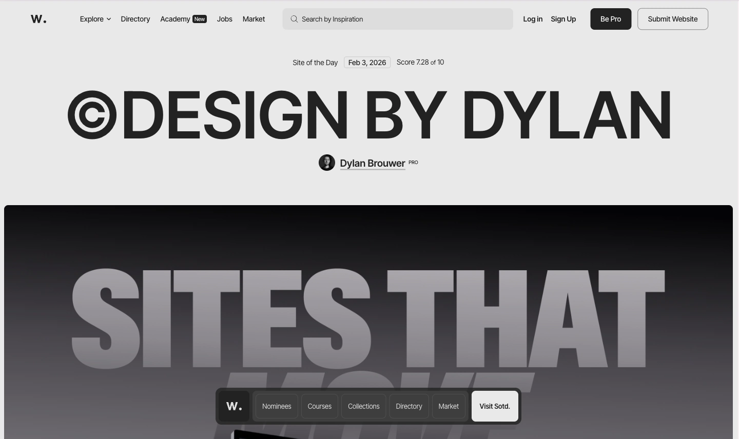
If you want to see another versions of this trend, browse through Awwwards. A lot of the top-ranked sites over the past year have played with asymmetric layouts and split-screen hero sections.
2. The Come Back of Bold Colors
Neutral tones have had a good run. Beige, off-white, muted greens. Safe choices that worked fine. But in 2026, brands are starting to get more confident using bolder color again.
You’re seeing stronger hero backgrounds, gradients that actually do something, and accent colors that clearly point people toward the things you want them to click. You’re also seeing more color blocking, where different sections use different background colors so the page feels easier to navigate.
There’s a term people have been throwing around for this: dopamine design. An article from Istituto Marangoni explains that the basic idea is that vibrant colors can trigger a positive reaction in your brain before you even process what’s on the page. It sounds a bit much, but the trend is growing fast.
The thing is, this trend only works when color is being used with a purpose. It should guide your eye. It should make things clearer. Slapping bold colors everywhere without thinking about it just ends up looking messy. The brands doing it well are picking their moments. A strong color on the hero section. A punchy accent on the main button. One section that pops while the rest stays calm.
Sites worth looking at
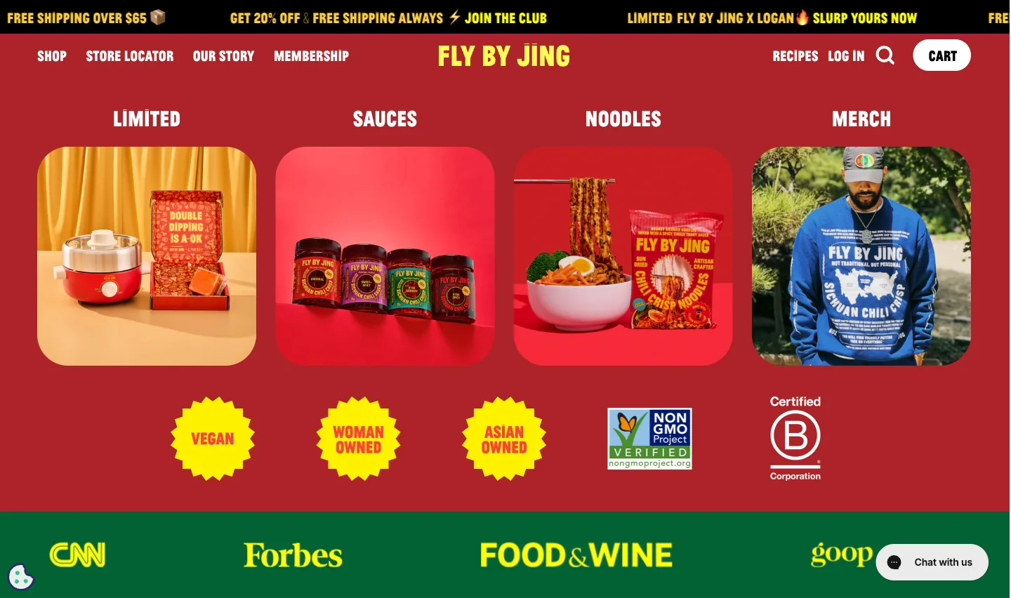
Fly By Jing is a great example. It’s a chili oil brand, and their site is full of vibrant color, but it all feels cohesive. Nothing looks random.
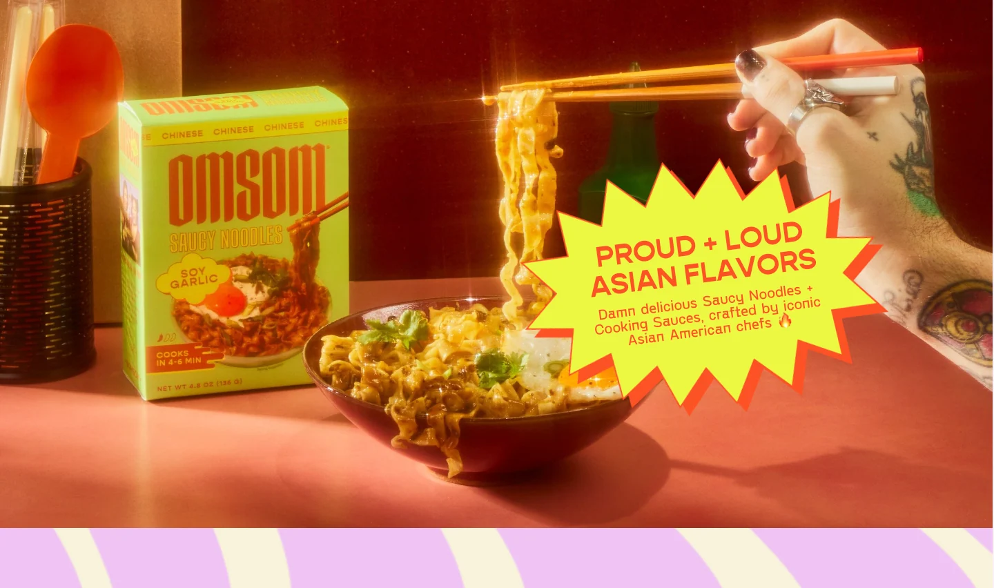
Omsom nails the same idea with bold colors and confident typography. It’s a food brand that helps people cook iconic Asian dishes at home using bold flavors and ingredients that are not always easy to find. Their site looks as bold as their flavors.
3. Typography That Guides the Reader
Typography in 2026 isn’t just about picking a nice font. It’s about making sure people actually know where to look on your page. And that’s a bigger deal than it sounds.
What you’re seeing more of is big headlines paired with smaller supporting text underneath. Clear hierarchy so you can tell at a glance what’s important and what’s extra detail. Better spacing and line height. And sometimes a subtle animation on a headline, like a fade-in as it scrolls into view.
The reason this matters comes down to how people actually use websites. Nobody sits down and reads a page like it’s a book. They scan. They look for the thing that’s relevant to them. Nielsen Norman Group research found that most people follow an F-shaped pattern when reading web content, scanning across the top and then moving down the left side. Knowing that, good typography basically becomes a way of directing where someone’s eyes go. If the hierarchy is clear, people get what they need faster. If it’s not, they just leave.
Sites worth looking at
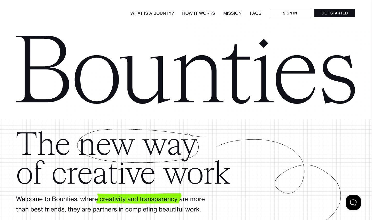
Bounties is a clean example of typography doing the work without trying too hard. The first thing you notice is the headline, and that’s the point. It’s big, it has space around it, and nothing on the page fights for attention. The smaller text stays in its lane, so the hierarchy feels obvious even if you only skim.
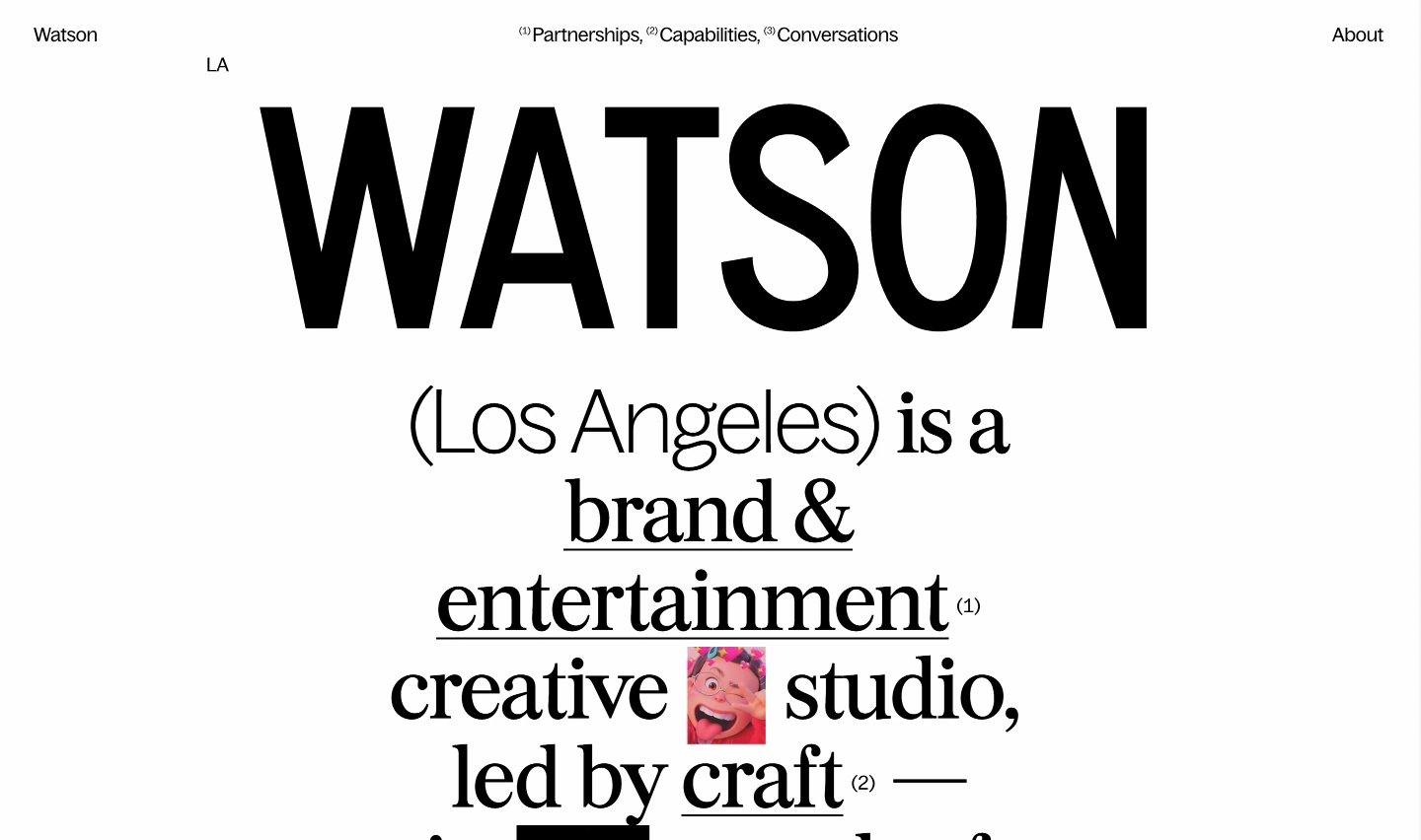
Watson takes a more “poster-like” approach. The type is the hero. It feels bold and intentional, like the site is confident enough to lead with words instead of hiding behind a big image. Even when there’s a lot of text, it still reads clearly because the spacing and structure are handled well.
4. Micro Animations That Feel Polished
You know when you hover over a button and it lifts slightly? Or a card does a subtle shift when your mouse hits it? Or a section fades in smoothly as you scroll down? Those are micro-animations. And they’re one of the things that separates a site that feels just okay from one that feels genuinely polished.
They’re not really about looking fancy. They’re about feedback. When you interact with something on a site and nothing happens, it feels dead. When there’s a small, smooth response, it feels alive. That’s basically what micro-animations do. According to Nielsen Norman Group article, they describes them as small visual changes that confirm an action or guide the user to the next step. Simple as that.
The best micro-animations are the ones you don’t actually notice on their own. You just feel like the site is smoother and easier to use. That’s the sweet spot. Go too far though, and it starts to feel busy. If everything on the page is bouncing and fading and sliding, it gets distracting fast. The key is being selective about where you use them.
Sites worth looking at
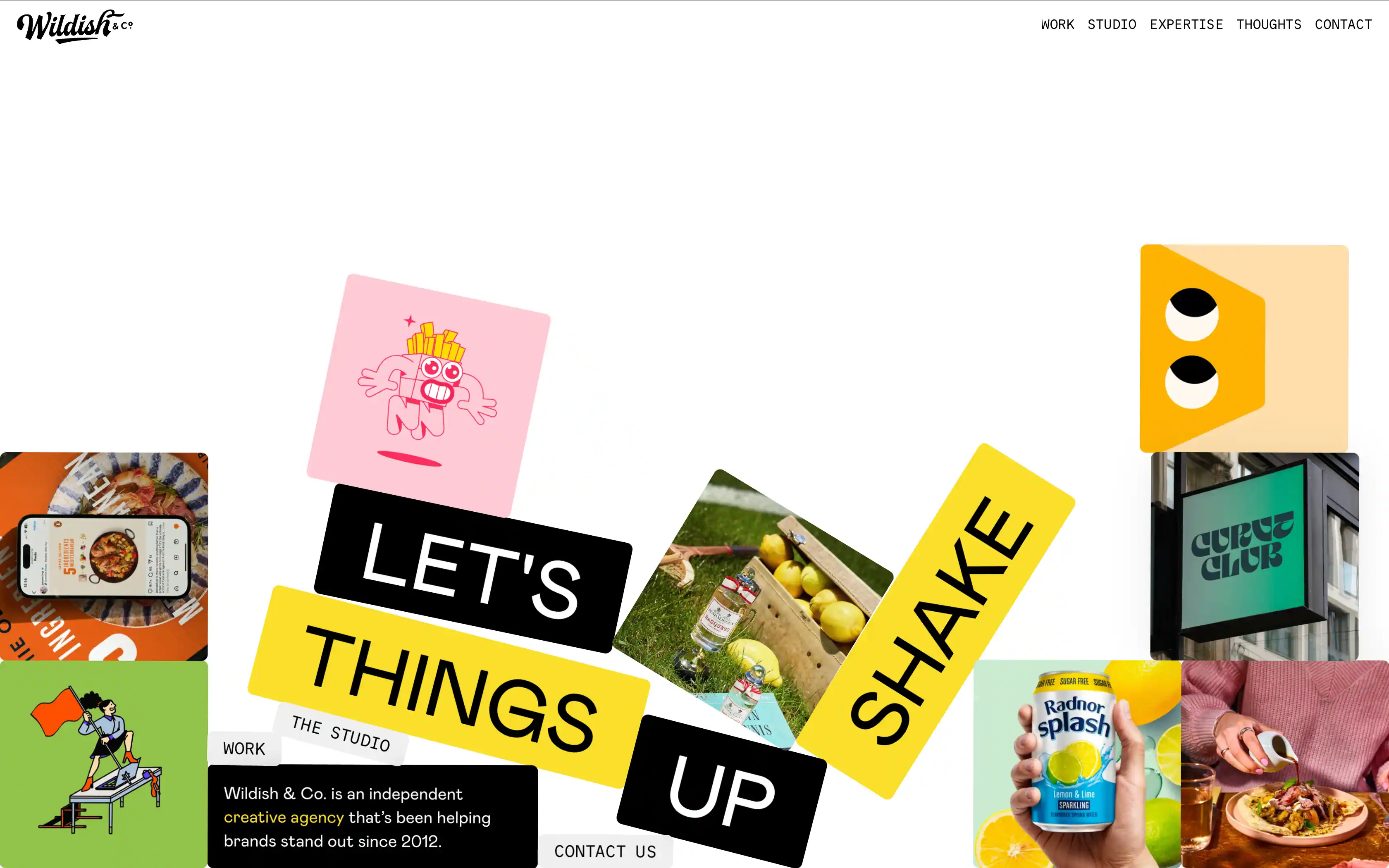
Wildish & Co. is a London-based creative agency. Their website uses micro-animations in a subtle way, mainly through gentle hover and scroll interactions.
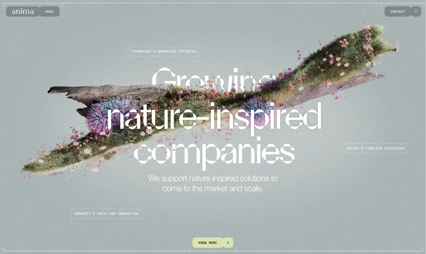
While Anima is a venture studio focused on nature-inspired innovation. Their site uses smoother, quieter transitions and small movements that keep the page feeling alive while still staying clean and easy to follow.
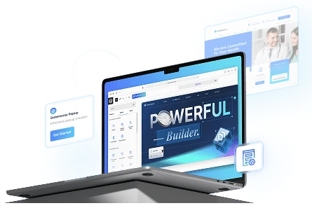
If you want to recreate a similar style, Gutenverse can make it happen for you. You can add micro-animations directly to your blocks using Animation Effects, so you can create hover movement, scroll-in reveals, and smooth transitions without needing custom code.
5. Accessibility First Design
Accessibility wasn’t always a priority. For a long time, it was something people handled at the end, if they handled it at all. But in 2026, that mindset is changing, partly because expectations are higher now, and partly because ignoring accessibility can create real problems.
But honestly, accessible design is just better design. Full stop. Better text contrast makes pages easier to read for everyone, not just people with disabilities. Clear headings help people scan faster. Keyboard navigation improves usability. Proper form labels reduce the number of people who give up halfway through a signup. Good alt text helps with screen readers and also supports SEO.
Sites worth looking at
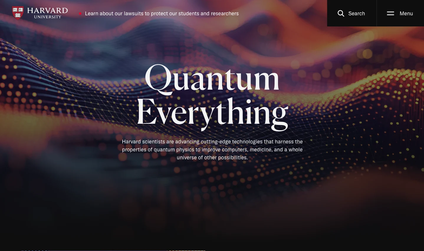
Harvard.edu is a solid example of accessibility done well on a large institutional site. The site offers reading support tools, includes multilingual video subtitles, and uses carefully considered color choices to support visitors with color blindness.
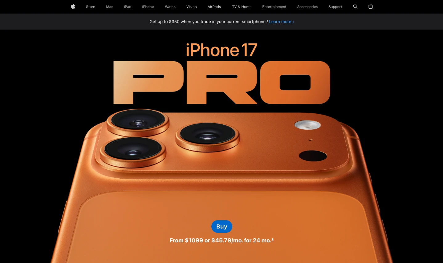
Apple.com demonstrates that accessible design doesn’t have to be plain or boring. They’ve got high contrast throughout, clear heading hierarchy, alt text that actually describes what’s in images, and full keyboard navigation. The site still looks premium and modern.
Final Thoughts
The best 2026 trends are the ones that improve the experience, not just the visuals. They make a site clearer, smoother, and easier to use for users.
Well, the good news is you don’t need a full redesign to apply these ideas. With Gutenverse installed on your WordPress Block Editor, you can implement most of them without slowing your site down or rebuilding everything from zero. You can adjust layouts, styling, and animations in a controlled way, then refine as you go.
Thanks for reading and I hope this guide helps you decide which trends match your brand in 2026. See you in the next article!


