












Designing a WordPress website can become frustrating when every small change takes too much work. You may need to build a new section, adjust your colors, or fix how the page looks on mobile.
The default WordPress block editor gives you a good place to start. You can add headings, images, buttons, columns, and other basic blocks without writing code. But when you want more control over your design, you may need additional tools.
That is where Gutenverse comes in. Gutenverse adds more design tools to the WordPress block editor, so you can create better-looking pages without switching to a completely different page builder.
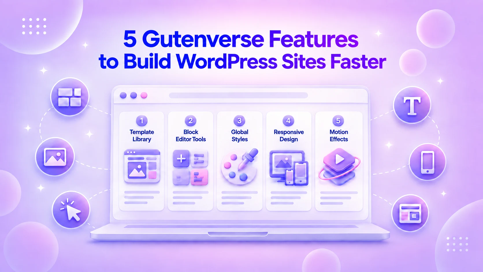
In this guide, we’ll look at five Gutenverse features that can make designing your WordPress website much easier and faster, from starting with ready-made templates to improving your design for different screen sizes.
How Gutenverse Helps You Build Better WordPress Websites
Gutenverse gives you several tools that can simplify different parts of the website-building process. You can start with a ready-made design, add more flexible blocks, keep your styles consistent, improve the mobile layout, and add features that help visitors take action.
Here are five Gutenverse features that can make designing your WordPress website faster.
1. Template Library Helps You Start With a Ready-Made Design
Starting from a blank page can make website building harder than it needs to be.
Before adding your content, you need to decide how each section should look, where everything should go, how much spacing to use, and which colors fit your design.
The Gutenverse Template Library gives you a faster starting point. Instead of designing every section yourself, you can import a ready-made layout or section and customize it for your website.
For example, you can find ready-made designs for:
If you are building a local business website, you don’t need to create the entire homepage from scratch.
You can import a layout, replace the demo content with your own, change the images, update the colors, and adjust the sections to match your business.
You can do all of this directly inside WordPress, so you don’t need to move your design to another platform or learn a completely different workflow.
2. Gutenverse Blocks Give You More Control Over Your Page Design
The default WordPress editor already gives you basic blocks for things like text, images, buttons, and columns.
That is enough for simple pages. But when you want to build a more complete website, you may need sections such as service lists, feature boxes, pricing areas, testimonials, forms, or more flexible layouts.
This is where Gutenverse blocks help.
Gutenverse adds more blocks to the WordPress editor, so you can build these sections without creating everything manually or writing custom code.
For example, you can use Gutenverse blocks to create:
The How To Add/Edit Block? guide explains how to add a Gutenverse block to your page. Click the + button, choose the block you need, then edit its content and design from the settings panel.
The main benefit is that you get more ready-to-use elements for building different parts of a website.
For example, instead of relying only on basic text, image, and button blocks, you can use Gutenverse blocks for things like feature sections, icon lists, galleries, forms, post layouts, and other parts of a page.
This gives you more ways to build your layout without creating every element from scratch or adding custom code.
If you want to see what you can build with them, check out our guide to the top 10 free Gutenverse blocks for the WordPress block editor. It covers several useful blocks you can try when building your pages.
You still build everything inside the WordPress block editor, but Gutenverse gives you more blocks to choose from when the default options are not enough.
3. Global Styles Help You Keep Your Design Consistent
When you design each block one by one, it is easy for small differences to appear across your website.
For example, you might use one blue for a button on the homepage, then accidentally use a slightly different blue on another page. Your headings may also use different font sizes or weights.
Global Styles help you avoid this by letting you save your main colors and typography, then reuse them across supported blocks.
With Gutenverse Global Styles, you can create styles for things like:
For example, you can create one global color for your main buttons and use that same color across different pages.
Later, if you want to change that color, you can update the global style instead of checking every button one by one.
The same idea applies to typography. You can create a heading style once, then reuse it across different sections so your headings look more consistent.
This is especially useful when your website has many pages. You spend less time repeating the same design choices, and it becomes easier to keep the overall look consistent.
4. Responsive Styling Helps Your Website Look Better on Every Screen
A page can look good on a desktop but may not fit as well on a smaller screen.
For example, a heading that looks fine on a large screen may take up too much space on mobile. Two columns may become too narrow. A section may also have too much padding, which makes visitors scroll more than they need to.
Gutenverse lets you adjust these details for different screen sizes.
With its responsive styling controls, you can switch between Desktop, Tablet, and Mobile views while editing your page.
You can then change the design for each screen size.
For example, you can:
This means you don’t have to use the exact same design settings for every screen size.
You can design the desktop version first, then check how the page looks on tablet and mobile and adjust anything that doesn’t fit properly.
For example, if a hero section takes up too much space on mobile, you can reduce its padding and heading size without changing how it looks on desktop.
This makes it easier to keep your website readable and comfortable to use across different devices.
5. Forms, Popups, and Animations Help Visitors Take Action
A website should do more than look good. It should also help visitors take the next step.
That could mean contacting your business, subscribing to a newsletter, asking a question, booking a service, or checking an offer.
Gutenverse includes several tools that can help you add these interactions to your website.
The Gutenverse Form Builder lets you add a form to your page and create fields such as text inputs, email fields, and submit buttons.
You can use forms for:
You can also use Gutenverse Popup to show announcements, promotions, newsletter offers, or other important messages.
Popups work best when they appear at the right time and support what visitors are already doing on the page.
For additional visual effects, Gutenverse Animation Effects lets you add movement to selected elements.
For example, you can use animation to draw attention to a hero image, an important feature, or a call-to-action section.
You don’t need to animate every element or add a popup to every page.
Use these tools where they make sense:
Because these features work within the Gutenverse ecosystem, you can add more functionality without relying on a separate plugin for every small feature.
How These Gutenverse Features Fit Into Your Workflow
You can use these Gutenverse features as part of the same website-building process.
For example, imagine you are creating a homepage for a business website.
You can start with the Template Library to import a layout instead of building the page from scratch.
Next, use Gutenverse blocks to change or add sections such as services, testimonials, buttons, or forms.
Then, set your Global Styles so the page uses the same colors and typography as the rest of your website.
After that, check the page on tablet and mobile and adjust the spacing, font sizes, or layout where needed.
Finally, you can add a form, popup, or animation if the page needs a clearer way for visitors to take action.
The process could look like this: Import a layout → Build the sections → Apply your styles → Check tablet and mobile → Add interactive features
This way, Gutenverse supports more than one part of the design process. You can use it from the first layout to the final responsive and interactive details, while continuing to work inside WordPress.
FAQ
The Template Library, Gutenverse blocks, Global Styles, and responsive styling are good features to start with. They help you build pages faster, control the design more easily, and keep your website consistent without writing code.
Yes. You can start with ready-made layouts and sections instead of building every page from scratch. After that, you can customize the content, blocks, colors, spacing, and other design settings directly inside WordPress.
No. You can build and customize pages visually inside the WordPress block editor. You can add blocks, change settings, import templates, and adjust the design without writing code.
Yes. Your website should be easy to read and use on desktop, tablet, and mobile. Gutenverse lets you adjust supported settings for different screen sizes, such as font size, spacing, and layout.
Start with the Template Library if you want the easiest way to begin. Choose a layout or section that fits your website, import it, then replace the demo content and adjust the colors, typography, spacing, and responsive settings.
Final Thoughts
Gutenverse gives you more ways to design a WordPress website without leaving the block editor.
You can start with a ready-made template, use Gutenverse blocks to build your sections, and apply Global Styles to keep your colors and typography consistent.
You can also adjust your design for tablet and mobile, then add forms, popups, or animations when your website needs more interaction.
You don’t need to use every feature at once.
Start with what you need most. You might begin with a template, customize the blocks, set your main styles, then check how the page looks on different screen sizes.
If the default WordPress block editor feels too limited for the design you want, Gutenverse gives you more tools while keeping the same familiar WordPress workflow.