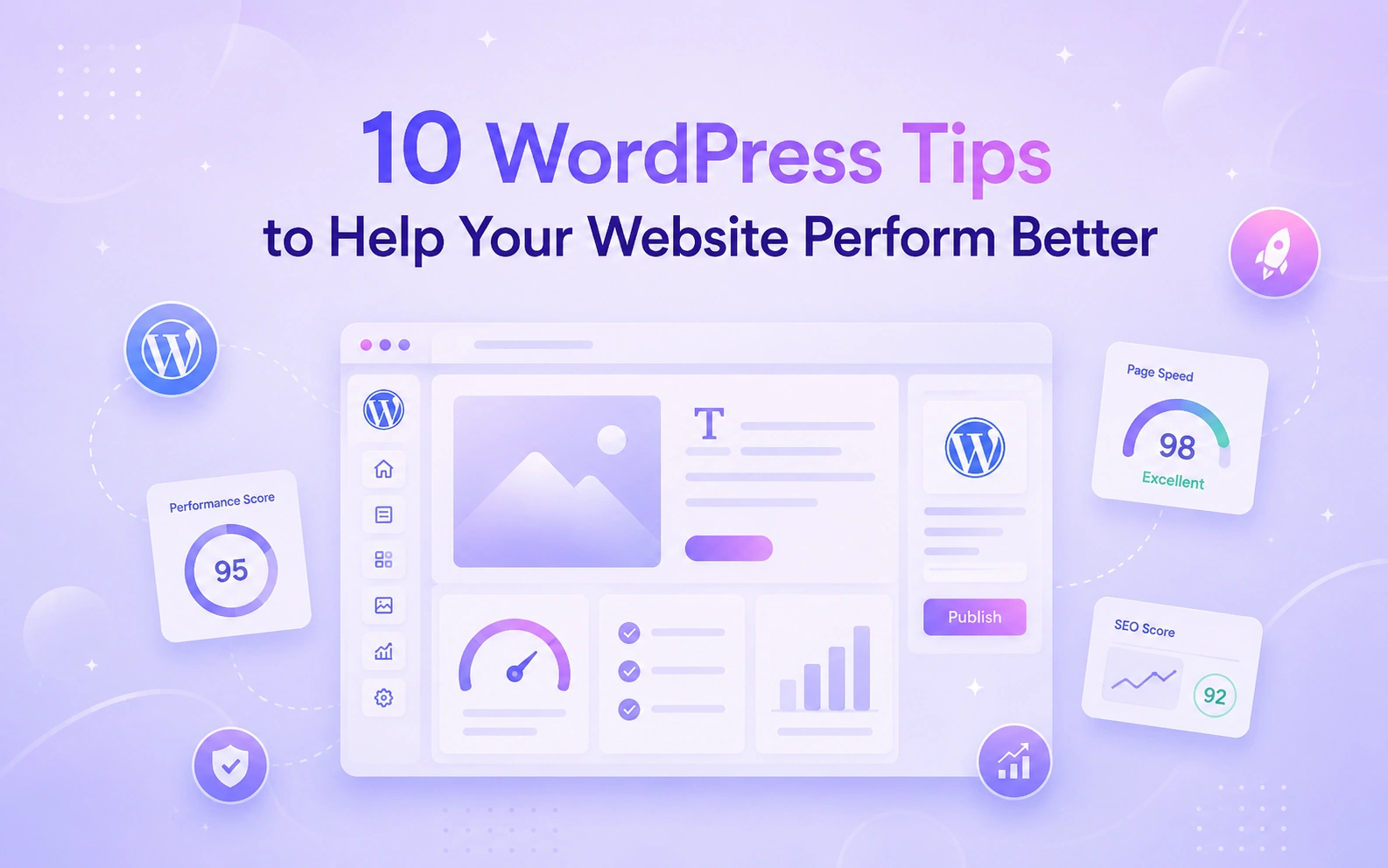
A better WordPress website doesn’t always need a full redesign. Sometimes, small changes can already make a big difference.
Your page may already have the right offer, images, and information. But a confusing layout can make visitors unsure where to look first. Tight spacing can make the page harder to read. A less visible button can make the next step easy to miss.
These small issues can affect your website performance too.
When we talk about performance here, we do not only mean loading speed. Speed matters, but your website also needs to perform well for real visitors. A site performs better when people can understand your message faster, trust your brand sooner, and move through each section without confusion.
Good design, clear structure, readable content, strong calls to action, and smooth mobile layouts all help your visitors take action. When these parts work together, your website feels easier to use and more useful to explore.
The good news is, you can improve many of these things directly inside WordPress. With Gutenverse, you can use blocks, templates, global styles, forms, popups, responsive controls, and animation effects inside the WordPress Block Editor and Site Editor. These tools help you improve your pages without rebuilding everything from scratch.
How to Make Your WordPress Website Perform Better
A better WordPress website often comes from improving the small details that affect the user experience. When your pages feel clearer, easier to follow, and easier to use, visitors are more likely to stay and take action. Here are 10 practical ways to improve your WordPress website step by step.
1. Give Every Page One Clear Goal
Before you change the design of a page, decide what that page needs to do.
Many websites try to make one page handle too many things at once. The homepage introduces the brand, explains every service, tells the full business story, shows all testimonials, promotes several offers, and asks visitors to click multiple buttons. When a page tries to do everything at the same time, it often becomes harder to understand.
That creates extra work for your visitors. Instead of following one clear direction, they need to scan more content, compare more choices, and guess what they should do next. In many cases, that confusion is enough to make people leave the page without taking action.
Give each page one main job. For example:
Once you set a clear goal, the rest of the page becomes easier to build. You can write a stronger headline, arrange sections in a better order, remove blocks that do not support the main purpose, and place your call to action where it feels natural and easy to find.
With Gutenverse, you can achieve the page around that goal by using blocks and sections that support the message you want to deliver. If you want to learn more about adding Gutenverse blocks and adjusting the settings from the sidebar, you can check this guide.
Keep this rule in mind: if a section does not support the main goal of the page, remove it or move it to a more suitable page.
2. Make Your Hero Section Easy to Understand
Visitors should understand your website as soon as the page loads. They should not need to guess what your site offers or spend time figuring out where to go next.
That is why the hero section matters so much. It creates the first impression and sets the direction for the rest of the page. If this section feels vague, crowded, or confusing, visitors may leave before they even scroll.
A strong hero section should answer three simple questions right away: What do you offer? Who is it for? What should people do next?
When you answer these questions clearly, you help visitors feel more confident. They can quickly tell whether your website is relevant to them, and they can decide what action to take without hesitation.
Try to avoid headlines like “Welcome to Our Website” or “We Help You Grow.” These lines may sound friendly, but they do not explain enough. They do not tell visitors what you actually offer, who you want to reach, or why they should keep reading.
A clearer headline gives people a reason to stay. For example:
After the headline, add a short supporting paragraph that gives a bit more context. Then place one main button that shows the next step clearly. This could be something like “Get Started,” “See Services,” “View Portfolio,” or “Contact Us.” Keep the focus on one main action so the first screen feels clear and easy to follow.
Try not to fill the hero section with too many choices, extra buttons, long paragraphs, or too much visual noise. When the top of the page feels simple and focused, people can understand your message faster.
Gutenverse makes this easier because you can start with a ready-made hero section from the Gutenverse Template Library. You can import a layout, replace the text and image, then adjust the button and other elements to match your goals.
3. Build Pages in Sections
A page often feels messy when you place everything in one long vertical stack without a clear structure.
You add a heading, then a paragraph, then an image, then another heading, another image, and a button. This layout can work for a simple article or short post, but it usually does not work well for a homepage, service page, portfolio page, or landing page. These types of pages need a clearer structure so visitors can understand the content faster.
That is where sections help.
When you divide a page into clear sections, you give each part of the page a specific job. This makes the layout easier to scan, easier to understand, and easier to follow. Instead of showing everything at once, you guide visitors from one idea to the next in a more natural way.
For example, a simple homepage can use a structure like this:
This kind of structure helps visitors move through the page step by step. First, they see what the site is about. Then they learn the key benefits. After that, they can review the services, see proof that others trust you, find answers to common questions, and reach a clear call to action at the end.
Each section should focus on one purpose only. A benefits section should explain the value. A testimonial section should build trust. A CTA section should encourage action. When each section does one job well, the whole page feels more organized and more effective.
Gutenverse makes this easier because you can import full sections from the Template Library or build your own layout with blocks. You can use icon boxes to highlight benefits, image boxes to present services, testimonial blocks to build trust, and form sections to collect leads or inquiries.
This also matches how people read online. Nielsen Norman Group has shown that people often scan web pages instead of reading every word. Clear sections give them better signposts.
4. Set Colors and Typography Before Styling Every Block
If every section uses a different color, font size, heading style, and button design, the website can quickly feel inconsistent and unfinished.
This usually happens when you style blocks one by one without setting a clear visual direction first. A heading looks one way in the hero section, another way in the services section, and then a different way again in the FAQ section. Buttons change shape or color from page to page. Backgrounds also shift without a clear reason. Even if each part looks fine on its own, the full page can still feel disconnected.
To avoid that, set a simple visual system before you start styling individual blocks.
You do not need a long or complicated brand guide for this. You only need a few clear choices that you can use across the whole website. For example, choose:
These choices give your website a stronger sense of direction. They help every page feel more intentional, more polished, and easier to recognize as part of the same brand.
This also makes your design process easier. When you already know which colors and fonts to use, you can build pages faster and make fewer styling decisions along the way. Instead of adjusting every block from scratch, you work from a system that already gives your pages a consistent look.
Gutenverse Global Styles can help you do this more efficiently. This guide shows how to set your colors and typography, then apply those styles across blocks. This gives you a better foundation before you move into detailed styling.
It also saves time later. Instead of fixing every heading one by one or updating buttons manually across multiple pages, you can keep your website more consistent from the start.
5. Improve Spacing Before Adding More Details
When a page looks too plain, many people try to fix it by adding more details.
They add more colors, more icons, more animations, more gradients, or extra background shapes. Sometimes those additions help, but in many cases, they don’t solve the real problem. The page still feels off because the layout itself needs better spacing.
Spacing often matters more than extra design details.
Good spacing helps visitors understand the page more easily. It shows which elements belong together and which ones should stand apart. It gives headings enough room to stand out, keeps paragraphs easier to read, and prevents buttons from feeling squeezed between other elements. It also helps each section feel cleaner and more organized.
Before you add more design details, check the spacing first and look at these areas:
These small details make a big difference. Even a well-designed page can feel uncomfortable to use when elements are put too close together. On the other hand, a simple design can look much more polished when the spacing feels balanced.
With Gutenverse blocks, you can adjust margins, padding, and layout settings directly from the block sidebar. This makes it easier to improve the structure of the page without changing everything else.
Start with small adjustments. You do not need to make every section much larger. You only need to give important content enough space and enough separation to feel clear.
Keep this in mind: spacing is not wasted space. Spacing is part of the design, and it plays a big role in how people read, scan, and understand your page.
6. Make CTA Buttons Clear
A call-to-action button should tell people exactly what will happen after they click.
Many websites use button text like “Learn More,” and that can work in some cases. But very often, it feels too general. It doesn’t give visitors a strong reason to act, and it does not tell them where the button will take them. When the CTA feels vague, people may ignore it.
A clearer button makes the next step easier to understand.
Instead of using broad wording, use a CTA that matches the action you want visitors to take. For example:
You should also match the CTA to the goal of the page. If the page should collect leads, send visitors to a form or consultation page. If the page explains a product or service, guide them to pricing, features, or installation details. If the page is a blog post, direct readers to a related guide, product page, or next useful resource.
This gives the page a stronger flow. Instead of leaving visitors at the end of a section with no direction, you show them exactly what to do next.
With Gutenverse, you can create these CTAs by using button blocks, advanced button blocks, or ready-made CTA sections from the Template Library. You can then adjust the text, style, spacing, and placement to fit the layout of your page.
Keep the button color consistent with your global style, but also make sure the button stands out enough from the background. Visitors should be able to notice it quickly without searching for it.
7. Build Trust Before Asking Visitors to Take Action
Visitors need a reason to trust you before they contact you, buy from you, or sign up through your website.
If a page asks people to take action too early, they may hesitate. They may like the design, understand the offer, and still choose not to click because they do not feel fully confident yet. Before visitors take the next step, they often want to know that your business is real, reliable, and worth their time.
That is why trust matters. You can build trust in different ways, depending on the page and the action you want visitors to take. Common trust elements include:
You don’t need to use all of these on every page. In fact, too many trust elements can make the page feel heavy. Instead, choose the ones that best support the goal of the page.
For example, a service page can feel more convincing when you show testimonials, past work, or short case studies. A pricing page can work better when you answer common questions and explain what is included. A contact page can feel more reassuring when you explain what happens after someone submits the form, how soon you reply, or who will respond.
These details reduce doubt. They help visitors feel more comfortable because they can see proof, understand the process, and know what to expect.
With Gutenverse, you can build trust sections using testimonials, logo sliders, galleries, accordions, icon boxes, and flexible layout sections. Even a simple FAQ or testimonial section can make a page feel more complete and more convincing.
Do not rush visitors into action before you build enough confidence. First, answer the quiet question in their mind: “Can I trust this?”
8. Keep Forms Easy to Complete
Forms can help you collect leads, but they can also make people leave if they feel too long or confusing.
When a form asks for too much information too early, visitors may hesitate or stop halfway. Unclear labels can also slow them down. If there is no success message after submission, they may not know whether the form worked.
For a basic contact form, keep it simple. In most cases, you only need:
That is usually enough to start the conversation. You can ask for more details later after someone reaches out.
Clear labels and a clear success message also matter. Visitors should understand what to enter and know right away that their message was sent.
Gutenverse Form Builder lets you create forms directly inside the editor. For more detailed information, you can read this guide to learn how to add the Form Builder block, add input fields, and adjust form settings.
A good form should feel easy for visitors to complete and still give you the information you need.
9. Use Popups at the Right Time
Popups can help your website, but only when they feel relevant to the visitor.
If a popup appears too early, it can interrupt people before they understand your page or your offer. But when it appears at the right moment, it can support the visitor journey and give them a useful next step.
A good popup should match both the page and the timing.
For example, you can offer a newsletter after someone reads part of a blog post. You can show a promo after someone scrolls through a product page. You can offer a lead magnet before someone leaves the site. You can also show a contact prompt on a service page after visitors spend time reviewing the details.
These popups work better because they respond to visitor behavior instead of interrupting it too soon.
Gutenverse includes popup feature, so you can create conversion-focused overlays inside the same website-building workflow. You can pair the popup with a clear offer, a simple form, and a CTA that matches the purpose of the page.
Try to keep the message focused and the action easy to understand. A popup should give visitors a helpful reason to respond, not another obstacle to close.
Think of popups as reminders that appear at the right time, not interruptions that block the page.
10. Check Mobile, Speed, and Motion Before Publishing
Before you publish a page, test it the way a real visitor would.
Open it on desktop and mobile. Scroll through the page, click the buttons, try the form, and watch the animations. This helps you catch small issues that can interrupt the user experience.
Look for these problems:
Gutenverse supports responsive styling through breakpoints, so you can adjust layouts for different screen sizes. The Responsive Styling shows how to choose a breakpoint, apply device-specific styles, and hide blocks through the Display Panel.
If you use animations, keep them subtle. Small hover effects or light scroll movement can guide attention. Too much motion can make the page feel distracting.
Gutenverse PRO also includes advanced animation features. For example, you can add movement based on scroll to create a more dynamic page experience. You can also control when an animation starts, so the motion feels more natural and supports the content more clearly.
You should also check page speed before publishing. Google recommends paying attention to page experience and Core Web Vitals, which cover loading performance, interaction, and visual stability.
So, don’t leave mobile, speed, and motion as the last things to check before publishing. They will affect how people use your website, how comfortable it feels, and whether visitors stay on the page.
FAQ
You can start with the hero section, page structure, spacing, and CTA. These areas help visitors understand your page faster and see the next step more clearly.
Your layout may need improvement if visitors struggle to find key information, sections feel too crowded, or the page looks inconsistent from one part to another. A clearer layout helps people scan the page faster and follow the content more easily.
Not always. In many cases, you can improve performance by fixing the page structure, spacing, hero section, trust elements, and CTA. Small changes often make a big difference without a full redesign.
Gutenverse helps you build clearer pages in WordPress. You can use blocks, templates, global styles, forms, popups, responsive settings, and animation features to create pages that are easier to understand and easier for visitors to use.
Yes. Gutenverse gives you visual tools inside WordPress, so you can adjust layouts, sections, spacing, colors, typography, forms, and popups without writing code.
Final Thoughts
A better-performing WordPress website usually comes from small choices that work well together.
You do not always need a full redesign to improve your site. In many cases, steady improvements to the basics can already make a big difference. When you make the page easier to understand, give each section a clear purpose, use stronger CTAs, build trust before asking people to act, keep forms simple, and check the mobile experience before publishing, the whole website starts to work better.
These changes may look small on their own, but together they create a smoother experience for visitors. They help people understand your message faster, move through the page more easily, and feel more confident about taking the next step.
With Gutenverse, you can handle these improvements directly inside WordPress by using blocks, templates, forms, popups, responsive controls, and animation effects. This gives you more flexibility to improve your pages without making the process too complicated.
Start with one page, fix the basics first, and keep refining from there. Small improvements done with purpose can lead to a much better website over time.