
A progress bar is one of the simplest UI elements you can add to a website. You also have probably seen them everywhere: in video players, file uploads, or even checkout flows. They are one of the most familiar patterns on the web, and when you build them with the right style and responsive behavior, they make a real difference to how your site looks.
The concept is simple. A progress bar fills a track to show what’s done, while the empty part shows what’s left. The real difference comes from how you style it, how it animates, and how well it is responsive on every different screen size.
In this guide, we’ll walk through how to create progress bars with style and responsiveness using the Gutenverse block.
When Should You Use a Progress Bar?
Progress bars make the most sense when there is a clear beginning and end to what you are showing. The most common uses are loading states, multi-step flows like onboarding or checkout, and displaying skills, stats, or achievements.
That last one is where they tend to make the biggest visual impact. Rather than just throwing numbers at your visitors, a progress bar puts those numbers in context. Someone can look at it and immediately understand where things stand, whether that is your top skills, how far along a campaign is, or other things as long as they’re measurable.
Making Your Progress Bars Responsive and Stylish
Here are a few things to keep in mind to help your progress bars look good and work properly on your website:
1. Typography and Labels
A progress bar without a label is just a basic colored line. Add the skill or task name above it and a percentage so people know what they are looking at. On smaller screens, check that the text doesn’t get cut off or squeezed.
2. Choosing Between Rounded and Square Corners
Pill-shaped bars look modern and friendly, and they work well on most sites. Square or slightly rounded corners feel more structured, which suits tech or business designs. Match the shape to the type of business you have, so it stays relevant and consistent.
3. Animate on Scroll
Set the bar to animate when it comes into view rather than when the page loads. It feels much more natural when it fills up right as someone scrolls to it.
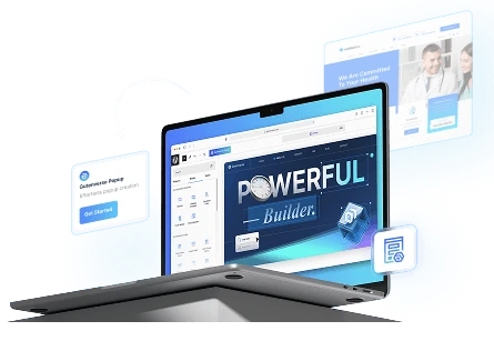
Getting started with Gutenverse Progress Bar block
This block is made for anyone who wants to customize the style, animation, layout, and responsiveness of the progress bar directly in the WordPress block editor, without needing to code or install extra plugins.
You can open the WordPress block editor or Full Site Editor, click the block inserter, and search for Progress Bar. Drop it anywhere on your page, then you can work through these settings to get the progress bar looking great:
1. Style
You can choose from styles like Default, Inner Content, Bar Shadow, Tooltips, Switch, or Ribbon, depending on how you want the percentage to appear.
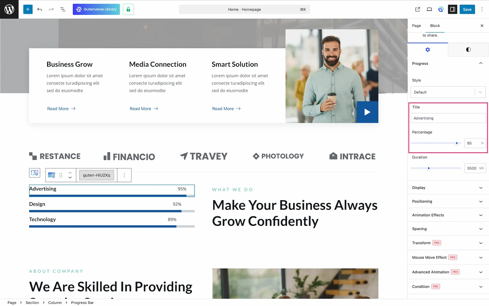
2. Title and Percentage
Fill these so visitors instantly know what the bar represents and can still see the exact value you want to show.
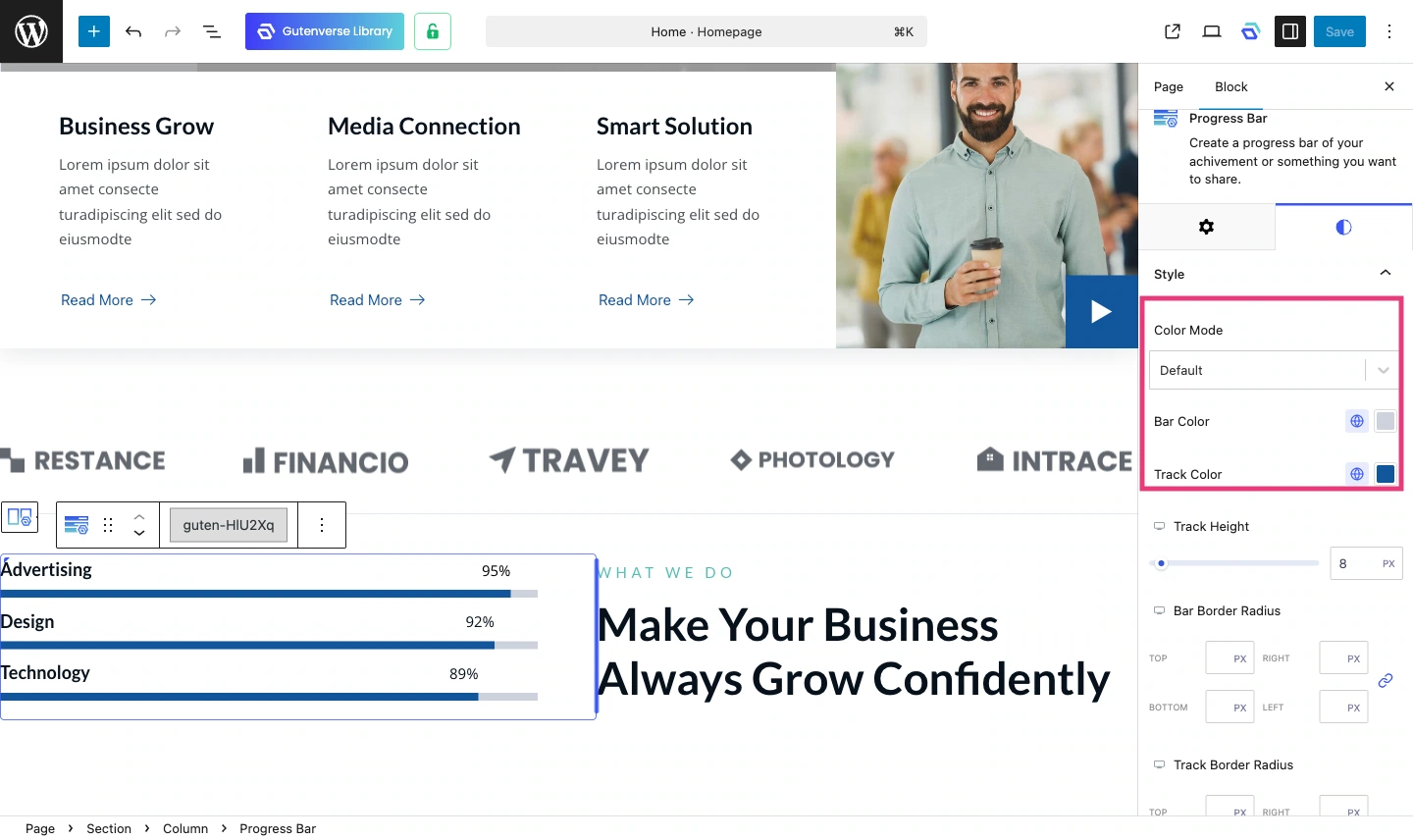
3. Bar Color
Use your brand’s main or accent color for the filled section. For the track, choose a different supporting color that still feels consistent with your palette.
4. Bar Height
8 to 12 px is the right range for most skill bar sections. It feels balanced, not too thin to notice and not too thick to dominate the section.
5. Border Radius
A high value like 99 px gives you a pill shape that feels modern and clean. A lower value like 2 to 4 px gives a sharper look.
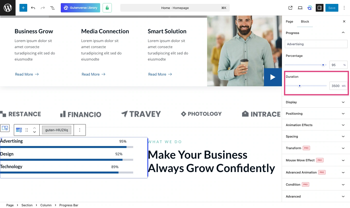
6. Duration
This controls how long the fill animation takes. Try to set up around 3 to 3.5 seconds if you want a smoother and more noticeable animation.
More About Gutenverse Progress Block Style Collections
1. Basic Style
It’s a solid horizontal bar with a label and percentage. It is clean, sleek, and adjustable in just about every way you can think of. A reliable option for showing progress on any kind of site.
2. Inner Content Style
This one puts the content right inside the bar itself. It looks neat and compact, and you can still customize the styling to match your site’s overall look.
3. Bar Shadow Style
Adds a shadow behind the bar to give it more visual depths. This adds a little more dimension to the bar and makes a noticeable difference.
4. Tooltip Style
A small label pops up above the bar showing the current percentage as it fills. Helps visitors follow the progress more easily.
5. Tooltip Box Style
Same as the tooltip style but the label sits inside a solid box, making the percentage a bit easier to read.
6. Tooltip Rounded Style
Same concept as the tooltip box but with rounded corners. A softer look that fits better on sites with a rounder design style.
7. Tooltip Circle Style
The percentage shows up inside a small circle above the bar. A more compact and eye-catching way to display the value.
8. Switch Style
The bar fills with a switching motion as it progresses. It gives a unique, eye-catching look that stands out from a typical progress bar.
9. Ribbon Style
The bar uses a ribbon pattern on the track. A great pick when you want the progress bar to feel like a real design element, not just a functional one.
Final Thoughts
A progress bar might seem like a small thing, but it can really change how a section feels. It makes numbers easier to understand, makes a page look more dynamic, and helps visitors take in information without having to think too hard. When it looks good and works well on every screen size, it improves the experience of your site.
With Gutenverse, you will not be stuck with just one progress bar style. You can adjust the look, animation, layout, and responsiveness right inside the block editor without touching any code. That gives you more time to focus on what actually matters: building something that looks and feels great.
If you want to go beyond with more advanced styling options and extra features, give Gutenverse PRO a try and see what else you can do with it.
That’s all for now. Hope this gives you a better idea of what you can do with the Gutenverse Progress Bar block. See you in the next post!


